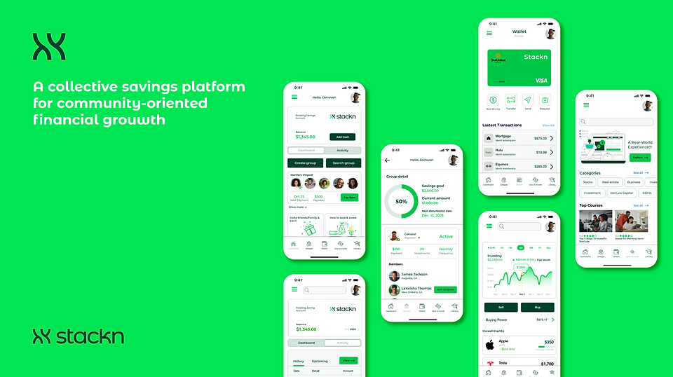
Brand Identity & Website + Product Design
Client: Stackn Savings
Role: Lead Designer
Year: 2023

Background
Stackn emerged in the wake of the pandemic, addressing the difficulties individuals faced in maintaining regular saving habits. The rise of fraudulent activities, such as blessing looms scams using platforms like Cash App and Venmo under the guise of savings groups during the shutdown, emphasized the urgent need for financial resources. Witnessing
a growing need for a secure and structured savings option, Stackn was created to leverage collective savings and financial knowledge within users' social networks.


Challenge
How might we introduce and encourage adoption of a Savings Club App that supports collective savings and financial literacy within users’ social networks?
Constraints:
-
Must enable users to form savings groups with trusted partners
-
Accessible anytime, anywhere across devices
-
Interface must scale and support varied, unrelated actions
Research
A user survey with 30 participants revealed:
-
73% unaware of savings clubs but interested in learning more
-
40.6% cited limited funds as a savings barrier
-
53.1% use mobile banking; 40.3% report medium financial literacy
-
Majority have incomes between $50K–$89K
Key User Groups:
Gen Z (18–24): Creatives or students needing collective support for gear or education.
Millennials (25–38): Urban professionals aiming for homeownership or stable housing.
Insights:
-
Users are motivated by goals like buying homes, traveling, and education
-
Many lack confidence in financial planning
-
There’s high interest in investment and community-based financial tools
Competitive Analysis
The competitive analysis involved heavy market research to grasp the nuances of the savings club model and the common functionalities utilized within other group savings apps available in the market.

Planning the App Structure
With clear user needs and goals identified, I began structuring the app to ensure intuitive navigation and quick user onboarding. The content and layout were designed to help users easily understand the app’s functionality, create savings groups, and track progress toward shared financial goals.
.png)
Iterations

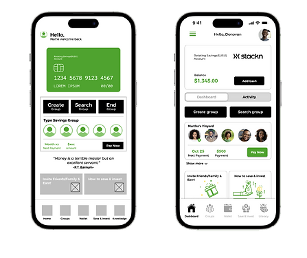
Dashboard
User testing of the low-fidelity dashboard revealed concerns about group control. Originally, the group creator had the option to “End group,” but users felt this gave disproportionate authority to one individual.
In response, the feature was removed and redesigned to require mutual agreement or group consensus before disbanding—aligning with the app’s collaborative values.
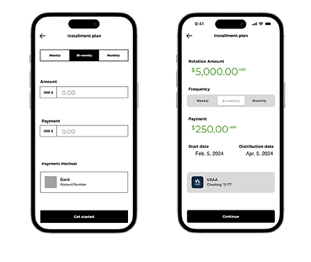
Flexible Payment Scheduling
Post-testing, the interface was streamlined to include customizable payment frequency. Users can now choose to pay their monthly installment total in weekly, bi-weekly, or monthly intervals. This update directly addressed concerns about rigid schedules
and supports financial flexibility based on individual comfort levels.
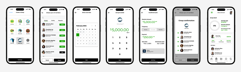
Create a Group
A member starts a savings group by inviting trusted participants. Each member reviews the plan and selects their preferred contribution frequency. Once the plan is finalized, members contribute until their designated turn to withdraw. The cycle continues until all members receive their payout.

Key Features

-01.png)

Impact & Lessons Learnt
Our users seek tools that support both financial literacy and goal-based saving. While saving is often difficult, a peer-to-peer savings app helps reduce barriers
by promoting accountability and community support.
What I Learned:
-
Never assume. Understanding real user needs, motivations, and pain points
is essential to building effective solutions. -
Test and iterate. User testing revealed critical insights that refined and improved
the design. -
Document the process. Capturing thoughts after each stage made the case study clearer and more reflective of actual decisions.
-
Reflect and evolve. Learn from what worked and what didn’t—understand
the why behind both to grow as a designer.